Baskin Robbins is a household name in the world of ice cream. Known for its delightful variety, the brand has gained worldwide popularity. Yet, there’s a clever secret hidden in their logo that many fans overlook. This article is dedicated to unraveling the Baskin Robbins logo’s hidden meaning.
Baskin Robbins’ Logo
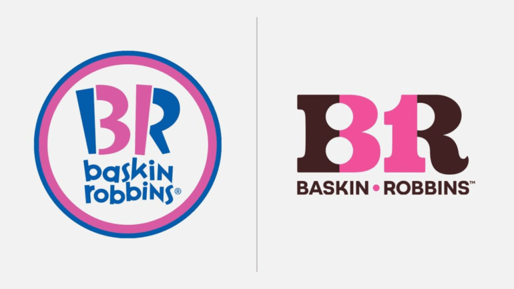
The current logo of Baskin Robbins was introduced in 2022. It is a more modern and less playful version than the previous one. The logo features the number 31 in pink, which formed by the pink parts of the letters B and R. The designers have replaced blue with brown, and the font is now more contemporary. The number 31 on the logo represents the number of flavors that the company offers.

History of Baskin Robbins’ Logo
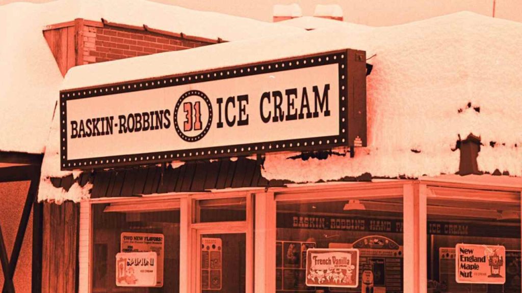
The story of Baskin Robbins’ logo is steeped in history. Starting in 1945 with Burt Baskin’s Burton’s Ice Cream Shop, and followed by Irv Robbins’ own venture, the duo eventually merged to create Baskin Robbins in 1953. The initial logo prominently featured the number “31”, representing the variety they offered. In 1991, a refreshed logo introduced the now-familiar pink and blue color scheme. The logo saw a modern update in 2006 and then again in 2022.

Baskin Robbins Logo Hidden Meaning
So, what’s the secret? The cleverly embedded “31” within the “BR” initials is the hidden gem. This number, indicating a flavor for every day of the month, has been a part of their identity since 1945. Baskin and Robbins were pioneers, offering 31 flavors when competitors were limited to vanilla, chocolate, and strawberry.
Color Psychology in the Logo
The choice of colors in the logo is strategic. Introduced in 1991, the pink and blue symbolized fun and reliability. The 2022 logo brought in a sophisticated brown while retaining the iconic pink and the hidden “31”.
How Number 31 Hits to Branding?
The incorporation of “31” is a testament to Baskin Robbins’ branding brilliance. The catchy slogan, “31 Flavors of Fun”, played a crucial role in their commercial success. Despite now having over 1,400 flavors, the “31” continues to be a homage to its innovative roots.

Conclusion
The Baskin Robbins logo hidden meaning is a fascinating example of brand storytelling. Through clever design and strategic branding, Baskin Robbins has created a logo that not only resonates with customers but also pays tribute to its rich history.
FAQs
Baskin-Robbins has crafted over 1,000 flavors, a significant leap from the original 31.
Their offerings include a mix of timeless classics and innovative new flavors to cater to diverse palates.
Also read:
7 Most Haunted Hotels In Arizona”
7 Most Haunted Places In The USA | These Places Have An Unimaginable Horror!


